Last week, Google took another step in encouraging site owners to properly optimize their mobile websites. And by “encouraging” I mean “forcing site owners do so under penalty of mobile search obscurity.” But Google’s not one to penalize indiscriminately (ha, almost typed that with a straight face), and has offered to set us wayward webfolk on the right track with their guide to building mobile-optimized websites and their list of common mistakes in smartphone sites. But it looks like this is just the beginning, as Google continues to impress upon the web world the importance of properly optimizing your mobile website. And in true Google fashion, failure to heed their warnings can result in a dark void where your mobile traffic used to be.
Yes, yes, we get it: mobile is important

Like many of you, my mobile phone is always with me. When I’m eating breakfast I’m scrolling through tech blogs; On my train commute to work I’m checking my emails; During the day it sits next to my laptop, alerting me to dinner plans via text messaging; and at night it’s perched on the edge of my nightstand like a gargoyle, its cycloptic “charging light” eye casting a faint green glow across my pillow, watching me as I sleep.
I spend so much time with my smartphone that if the cell radiation FUD stories are true, someday my phone and I may literally be joined at the hip in some sort of biological mutant technomonstrosity. And I know I’m not alone, because I see others out there that spend even more time on their smartphones than I do: texting while driving, walking while browsing, Facebooking while intoxicated, playing Angry Birds under a falling piano, and any number of potentially hilarious and deadly situations…well, funny if they were cartoon characters.
Yes indeed, mobile optimized sites are important. Especially for those businesses in the travel industry (I’m looking at you, hotels). After all, travelers tend to do what they do best: travel. And that means their on-the-go lifestyle goes hand-in-hand with mobile website accessibilty.
Website success 3 years ago ≠ Mobile site success this year
In the past your hotel might have been able to get by with a poor mobile presence. Maybe your standard website performed admirably in the search results, plus it was a few years back so mobile wasn’t as ubiquitous as it is today. In those days–the good old days, you remind yourself–a mobile site for your hotel was just another bit of eye candy for the main attraction: your standard desktop site.
And let’s face it, you just didn’t have the budget this year to create a mobile-optimized site anyway. It happens. And in the good ol’ days, you could always plead ignorance to the SEO gods and beg for forgiveness if your hotel’s website performed poorly on smartphones and other mobile devices. You knew the search giants didn’t really scrutinize mobile sites the way they do your normal desktop site, so you focused your energy on those standard webpages instead. Plus, maybe mobile traffic to your site was still in its infancy. Still, seeing this the SEO gods would shake their heads from on high and tsk-tsk your decision to remain mobile-averse, like a parent does their reckless teen. “Foolish mortals,” they’d mutter with arms crossed, all the while planning your site’s impending doom with a swift and righteous algorithm change that would quickly smite your site’s humble existence from the face of the internet.
The SEO gods are angry, my friends. And only an offering of a well-optimized mobile site will quell their tempestuous rage!
Evaluating your website using common sense
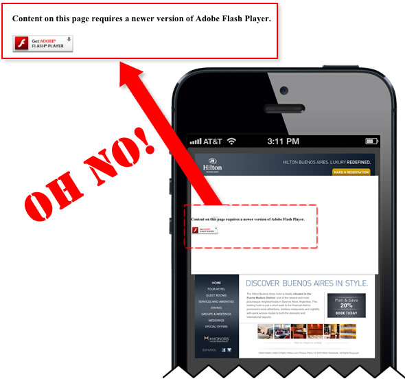
Sure, none of your website’s Flash videos play on iPhone or Android phones–replaced instead by an imposing white block smack dab in the middle of your homepage–but at least the text still shows up, you assure yourself. And despite the fact that your webpages take 5 minutes to load on a 4G smartphone, you shrug your shoulders and rationalize that patience truly is an underappreciated virtue, and your website is simply giving your visitors a chance to appreciate that virtue more than they ever have before. Use common sense–if those things drive you crazy on others’ mobile sites, then why would you force the same horrible user experience on guests of your own site? It’s bad for business.
It’s time to change your ways before it’s too late. By now you should have some form of smartphone presence, but is it truly optimized for smaller screens and slower internet speeds? Fortunately, Google provides a roadmap of sorts to help you sort through your mobile site issues. Let’s have a look.
Explaining the common mistakes on smartphone websites
Check out Google’s official developers portal for the full list of common mistakes you’ll find in your smartphone website, but here’s a quick breakdown with a few explanations and images:
- Flash videos and other unplayable videos – iPhones don’t play Flash videos. Neither do Android phones. This means that if your beautiful desktop website has an amazing Flash slideshow at the top of your page, your mobile guests will see a big white void in its place. It’s annoying to mobile visitors. Plus, with HTML5 taking shape with specific tags for video, there’s no reason you have to rely on Flash for slideshows or videos. Avoid providing crappy usability for your mobile guests.

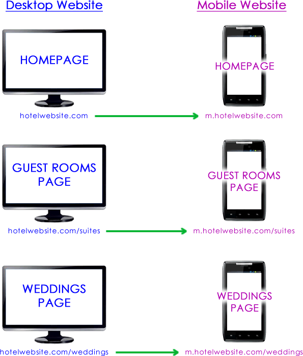
- Redirecting mobile users to the wrong page – Your website can be set up to detect whether a user is arriving from a mobile browser or a desktop browser. Depending on which is detected, your site can present a different page to guests (mobile vs desktop). Are guests looking for your hotel’s wedding page on their mobile devices? Set up the site so that it redirects those visitors to the mobile wedding page instead of sending them to the mobile homepage, like so:

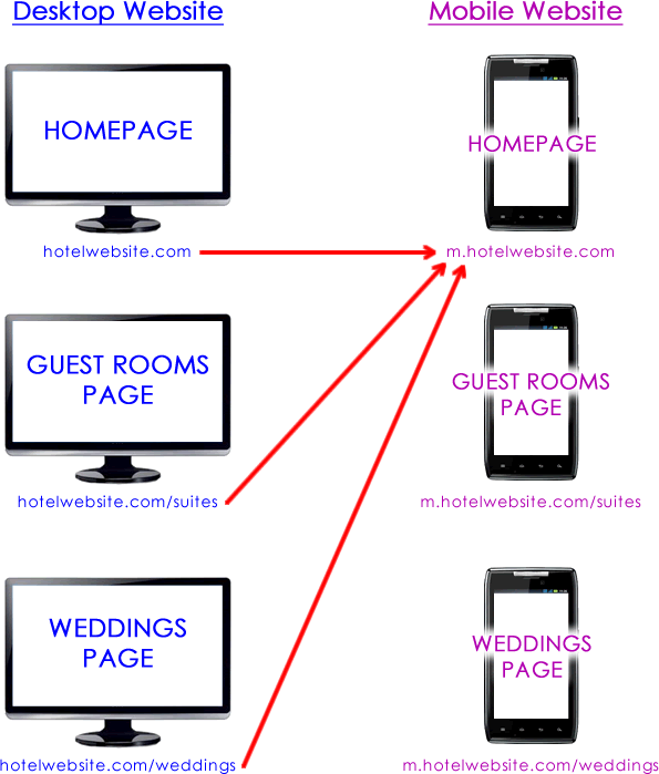
- On the other hand, let’s say you only have a single mobile page. And let’s say your mobile guests try to access your dining, accommodations and wedding pages. If you redirected all these visitors to your mobile homepage because you didn’t have a mobile version of your dining, accommodations and wedding pages, then you are guilty of a faulty redirect and your site will likely be punished. Don’t do this:

- “This page can’t be found” errors – Commonly known in the biz as 404 errors, some sites have been improperly configured so that if a user visits your site on their smartphone it displays the dreaded “404 error: This page cannot be found” message. Your site visitors have reached a dead end and are now lost and confused. Looking for directions to the hotel? Well, I’ll just click on this little map link and…404 error?! What the heck? How am I supposed to find what I’m looking for on the site if the pages won’t even display properly? Fix these 404 errors and save your visitors the headache.
- Keep mobile users on the correct site – Google refers to this as “Irrelevant cross-linking.” It just means that if a user comes to your mobile site on their mobile device then all the links on that mobile webpage should point to other pages within the mobile version of your site. You wouldn’t want users on your mobile site to click the Accommodations link and suddenly end up on the desktop version of the site! Why would you do that? Most likely it’s an accident, but it should be cleaned up. In fact, it’s likely that the only place you’ll really cross over from mobile site to desktop or vice versa is if you have a “view desktop site” on your mobile pages or a “view mobile site” link featured on your desktop site.
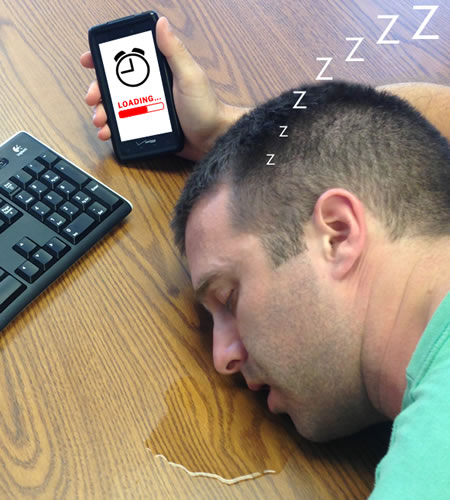
- Page speed – I, like many of my mobile-equipped brethren, have no patience for slow loading sites. This is true in the world of standard websites, but it’s crucial in the smartphone world. If a page doesn’t load on my smartphone within 10 seconds it’s dead to me. I have so many feeds and photos and games and apps on my smartphone that if I’m given 10 seconds of downtime my scrolling finger doesn’t know what to do with itself and instantly seeks other areas of my phone to explore. There are lots of ways to make your mobile site load faster: decrease image file sizes, use browser caching, minify your code and more. If you don’t, you’ll soon find faster loading competitor sites smacking your site down to lower search rankings.
Fix your mobile problems now!
Make sure you or your hotel online marketing team take a good look at your hotel’s mobile website and address any of the issues identified by Google as explained above. Failure to do so will likely result in your site ranking lower in Google’s mobile or smartphone search results. And while you may have shirked off mobile as a viable traffic source in the past, today, smartphones have become the computers we’re connected to 24/7. We’ve seen mobile traffic compose about 20-30% of our hotel websites on average, and that number is steadily rising each year. Neglecting mobile is a good way to ignore about a third of your potential visitor base. And just keep in mind that it’s much easier to fix mobile website issues now, rather than trying to recover from a massive Google penalty smackdown later. And while Google has announced these fixable items on their blog, you can bet the same smartphone policies apply to Bing’s search results as well.
The goal of the two search engine titans, Google and Bing, is the same: provide the most relevant, most authoritative search results to its user base. If your site loads slowly on smartphones it’s no longer relevant because you haven’t updated your site’s structure to keep up with the on-the-go smartphone user. And if your site is no longer relevant, it’s no longer an authority in the online marketplace. Just be sure to take care of your mobile site and the search engines will take care of you.


