Chances are, if you are reading this blog you have an interest in staying on top of ongoing trends, keeping a pulse on what is modern and fresh, and most importantly, are looking to gain insight into anything that will give you a leg up on the competition. Lucky for you, you are about to get a breakdown of actionable information that can make a huge difference for your hotel website as we progress into this year.
Trends Broken Down
2019 was certainly a year. Full of a lot of high and low points — open to interpretation of course depending on your glass’ water level. We watched the Game of Thrones series finale, saw the first ever picture of a black hole, enjoyed memes like lady yelling at confused cat ![]() or the storming of the gates at area 51. But 2019 also marked a significant time in website design and development, especially in the realm of hospitality. As we progress into 2020, things are starting to get interesting. We are moving away from pure design trends, and we at Blue Magnet embrace this change. Therefore, we are going to break down the real difference makers in 2020 and give you insight on how to take direct action to ensure you get a piece of that sweet, sweet, decennary pie. (Foreshadowing: It is not all about looks. Jon Snow will tell you that.)
or the storming of the gates at area 51. But 2019 also marked a significant time in website design and development, especially in the realm of hospitality. As we progress into 2020, things are starting to get interesting. We are moving away from pure design trends, and we at Blue Magnet embrace this change. Therefore, we are going to break down the real difference makers in 2020 and give you insight on how to take direct action to ensure you get a piece of that sweet, sweet, decennary pie. (Foreshadowing: It is not all about looks. Jon Snow will tell you that.)

Wait there’s pie?
Visual Design
I know I was just on my high horse about hotel web design and website visuals in general, but that is for a reason. Design is only a sliver of what makes your website successful. Say it with me, “Design is only a sliver of what makes your website successful!” (Remember that for later) Is it important, YES; in fact, it is often times is your first impression with a user. Given, first impressions are incredibly powerful and as subjective as they are, 2020 web design trends are pointing in a particular direction, especially in hotel web design. Here is what is on Blue Magnet’s radar and some actionable takeaways and examples.
Soft Shadows, Layers and Floating Elements
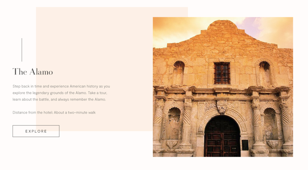
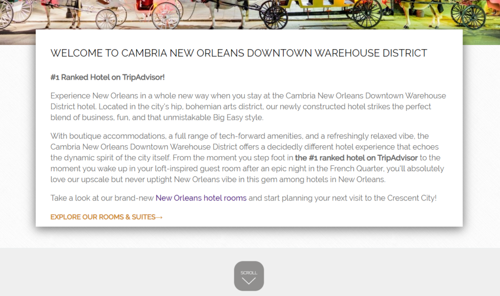
Locked into battle like the Heat and Snow Miser, flat web design and layered, shadowed design have seen surges in popularity. 2019, seemed to sway a smidge in flat designs favor, but fear not texture fans; shadows, overlapping, floating & layered elements are battling back. The key to this design technique is creating depth by giving the user an experience of spatial indulgence. Design-romantic sentences aside, adding soft drop shadows and overlapping elements on each other give the user the feeling that your website elements are real. They play by the rules of physics and giving them tangible texture solidifies them in your brain. In many ways this tangibility is what hoteliers are searching for in their websites. How do I convey what a stay at my hotel is like to someone on the internet? Layered, depth-driven design is a step in the right direction.
Tips for creating layered design:
- Do not break the rules of physics, elements that overlap each other should remain consistent, same with shadow direction.
- Use of patterns are a great way to add depth and a tactile feeling to an element.
- Wireframe with actual pieces of paper to help visualize the floating, layered appeal of elements.
Examples:
Bold Color to Evoke Certain Moods
Look for more brands to get bold with their choice of color to represent the look and feel they are going for. White-space and dark-mode styled sites / design are not going anywhere, but there is some opportunity for risk takers out there. However, it should not be about who can choose the most outrageous colors. Think about your brand, your property, your market, and even the psychology of color when choosing a color scheme. In fact, we have written about the psychology of color and how to use it before on the Blue Magnet Blog.
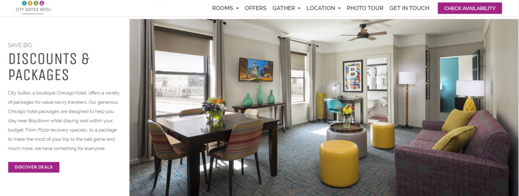
Chicago’s City Suites Hotel has bold interior design colors mirrored on the website.
Solid Frames of White Space
Structure and white space has been a modern web design tenet for a few years now and 2020 shows no sign of parting with tried-and-true architecture. Clean framing and structure of website elements give a sense of stability and allows for elements that break this common format to stand out. Organized, framed elements on websites do a lot to create a sense of order and helps the user digest content in a logical, planned manner.
Tips for using white space and framing:
-
- Give thought to the elements that you plan to emphasize, pay attention to the message you want to highlight.
- Think about the order of your content, ensure it can be parsed in a logical order by the user.
- White space does not actually have to be white, it can be a different color, or absence of color. “Negative space” is another way to think about it.
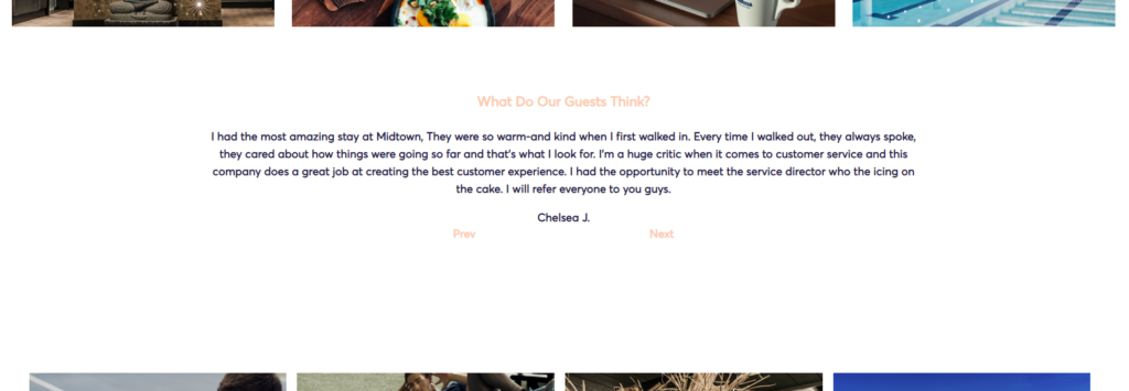
The Hotel at Midtown showcases their stellar reviews encased in white space.
Content Design
The 2010s have changed the scope of the internet and society as a whole more drastically than any other time in history. It is a topic that could be a blog post of its own, so I will stick to the sparknotes version. In the last decade we went from some people owning a smartphone, to just about every human on the planet having access to a phone. Machine learning and AI have dramatically escalated the rate we can absorb and process data. At the start of the decade, javascript frameworks were barely gaining traction and Flash was just starting to get a bad rap. Now, there are more and more frameworks and libraries for web development that no one can actually keep up with them all, and website builders allow for decent looking websites to be created with a minimal amount of coding knowledge. Why is this important? As teased earlier, design is keeping up with these technologies. The amount of people and entities that can create a website is most likely at its highest point, resulting in a fundamental truth; it is harder for a website to stand out and be successful that it has been before in the entire history of the internet. Staying up with design trends are important, but just like a car or house, a new coat of paint is not going to fix all the problems. Therefore, as experts in hotel digital marketing we need to dive deeper into what will make our websites successful. This all starts with what we are experts at: the content of the website.
Rich Content
So you have optimized your design, you have a modern beautiful look that expertly showcases your hotel and its personality. Problem is, you are not getting the traffic you expected, and when you look at analytics you see that users that do visit are not staying and are bouncing quickly. I’ll reuse the car analogy from earlier, this is the equivalent of having a fresh paint job, tinted windows, a sporty spoiler… and a rusty crusty engine — you are going nowhere.
Websites need juice, and the high octane juice of digital marketing is rich content writing. It truly can be potent stuff as a page with optimized, rich content can assist with two of the most powerful attributes of a website’s success.
-
-
- Each web page should accomplish a goal, and, in most hotel website pages, the goal is to give the user what they are looking for in order to persuade them to book/check rate. If the page is strong, well written, and provides the user with what they are looking for, you are going to get more heads in beds.
- Google and SEOs that study search algorithms, have essentially been screaming from the rooftops the value of strong, semantically optimized, rich copywriting on websites. Bygone are the times of keyword stuffing and meta optimizations just like Google+ (sorry Google, please still rank this post high!) and viral videos like “GANGNAM STYLE” and “What Did the Fox Say.” Instead, we are watching sophisticated technology aimed dynamically at satisfying users queries. Here are some associated trends we are tracking:
-
- Google using NLP (natural language processing) to further semantically understand and evaluate website content.
- Optimizing Towards Featured Snippets: Written about in our 2020 Digital Marketing Trends blog post.
- The prioritization of Mobile-first Indexing & Site Speed becoming important ranking factors.
-
Take Your Content to The Next Level:
Blue Magnet Interactive can elevate your content to the next level. With our approach to epic content and long history of developing robust landing pages, we are the first step in taking your website to the next level. Eager to get the creative juices flowing? Reach out and learn how we can make your content epic.
Personalization + Dynamic Content
Dynamic content and personalization is slated to be a significant game changer in website development moving forward. Users convert the most when they feel catered to, ideally a hotel website should be like a hotel room: inviting, comforting, and giving the guests the feeling that every detail of the room was tailored to their stay. Blue Magnet is investing in tools and technology to help deliver dynamic content to users running on data-driven intelligence and analytic information.
Examples of Website Personalization:
-
-
- Dynamic popup messaging based on the path the user has navigated through your site.
- Targeted followup emails that ping the user after cart abandonment.
- Special offers that display based on a defined base of criteria.
-
How are you going to become someone’s brand?
Inclusive Design (ADA Accessible)
One of the first rules of business you are taught is to market and sell to your customers. Each and every customer provides great value to your hotel. What happens if you were to not address a specific subset of potential customers — you lose out on that value and potential to make a lifetime fan of the brand. Inclusive Design is not front of mind for some digital marketers and which hurts them and users who want to use their website but hit roadblocks due to this oversight. Especially in the hospitality industry, we need to be cognizant of people who might need extra assistance on property and/or on your website. Therefore, it is our duty to provide users with everything they need to evaluate and understand the details they are looking for about the hotel. Examples would be: a specific list of accessibility amenities and in-room accessibility features, and descriptions of what your property offers in assistance to users with disabilities.
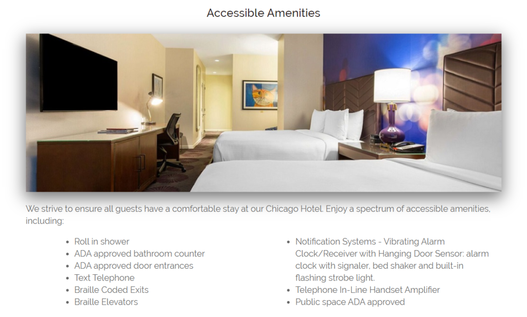
Example of outlining in-room ADA accessible amenities.
Technical
The final component of where 2020 will be taking the website world lies truly behind the scenes in the technical architecture of the site. While not as flashy and easy to screenshot, some fundamental benefits or weakness can become difference makers and they all stem from the back end of the website. Again, this is a topic that could become its own blog post, so for now we will stick to a birds eye view on dive in on the few actionable takeaways.
ADA Compliant
The number one objective of website accessibility is to provide an analogous experience to users with special needs. Providing information and description of accessible amenities is only half of what developers need to consider. Coding the website in a manner so it can be used by users with assistive technology, special considerations, and disabilities, is the other piece of the puzzle. For a more in-depth review of how to achieve this, please read our comprehensive guide from Blue Magnet Interactive owner Matt Bitzer.
Load Speed
Teased in the Rich Content section earlier, SEOs are noticing site speed to be an increasingly strong ranking factor for websites. However, the benefit of a fast page load time will go much farther than a few positive ranking factors from Google. Don’t believe me? Think about the last time you were browsing on your phone and something took awhile to load. Maybe it was wifi, maybe you hit a deadspot when traveling, but we have all had that same frustrating feeling. 2020 and beyond humans are only going to become more and more impatient. Optimizing your site speed now and continuing to monitor and work on it, is the best way to future-proof your site.

You’ll have to be quicker than that.
Areas to audit for site speed optimizations:
-
-
- Use tools like GTMetrix and PageSpeed Insights to identify problem areas on your site.
- Look into serving next-gen image formats on your site.
- Consider investing in a Content Delivery Network (CDN) to increase speed via deliverability on your site.
- Consider upgrading your site’s hosting to a more powerful and capable server.
-
Takeaways
While the power of popularity is undeniable and while we will certainly continue to see its effects on “modern” website design, fundamental changes to technology are decreasing the frequency of “fads” or even at a more basic level, shifting the focus to deeper level questions hoteliers will need to ask themselves. So while design may ebb and flow with what is hot, an accomplished hotel website sees past the flashy visuals, and to the core of what a good website accomplish for its users. Getting this right is the key to ongoing success and a future-proof, devastatingly competitive digital presence.
If your website is stuck in the past and not optimized for the upcoming future, our team of design and development scientists can deliver a robust marketing engine, a future-proofed website. Reach out and let us know what is outdated on your website and we will tell you how to take your website to the next level.
