As hoteliers, budget season is upon us so now is the perfect time to ensure you have the resources in place to create and optimize that ROI-producing mobile-friendly site everyone is raving about. With the increased importance of SoLoMo (social local and mobile opportunities, for the uninitiated) in 2012 and 2013, if you don’t have a mobile site you’re already behind the eight ball, but there’s still time to get back ahead of the competition. Creating a site using responsive web design may be the most efficient and budget-friendly option for your hotel to ensure your presence is optimized for all booking devices.
What is responsive web design?
Simply put, responsive web design is a development technique that optimizes your site for any sized screen, based on size of the device that is viewing the content. For example, if someone views your site from their desktop computer, the website’s code will detect the larger sized screen and appropriately adjust the site’s layout and design for that larger monitor. Things such as the main navigation, body content and image size will be optimized for people browsing at a desktop computer, in order to provide the best layout for usability on that device.
On the other hand, the same user will likely interact with the site very differently on a tablet or smartphone than they would sitting at a computer with a mouse or a laptop touchpad. When searching on a tablet or mobile phone, users have to tap directly on the link in order to get the information they want, instead of hovering over the information with a tiny pointer. In order to provide the best user experience for someone on a mobile phone, buttons have to be bigger so people can easily tab where they want, phone number should be clickable (and trackable!), and information should be concise and easy to find. Fat fingers and small smartphone screens are a bad combo.
What does responsive web design look like?
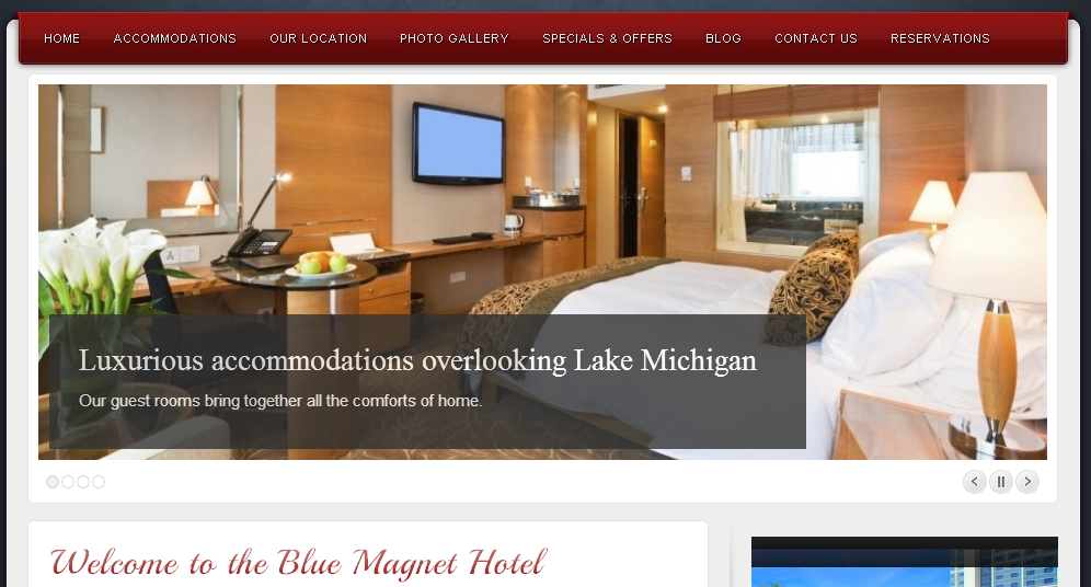
Let’s use the beautiful but imaginary Blue Magnet Hotel as an example. Say you’re searching for the Blue Magnet Hotel on your desktop computer during your lunch break at work. You will see the full site like this:
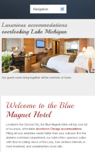
Then, on your way home from work, you decide that you liked what that hotel had to say and you want to check out rates on your phone. The site would look like this.
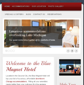
Finally, when you get home, you announce to your spouse that you found the perfect hotel and want to get their final approval before you book your room using your iPad.
The same content is presented and the changes are very slight, but the site dynamically adjusts to make the site more usable based on the viewing screen of the device being used.
Why does my hotel need a responsive website?
Below are 4 reasons you should consider building your hotels site in responsive web design:
- Usability and user experience: Think of how annoying it is when you are searching for something on your phone and you land on the site’s desktop version, with microscopic links and too much information. What do you do? Most likely you’ll try to pinch and zoom on the screen until you can make out the information you’re looking for or bounce off immediately and go to a site that’s easier to use. Either way, this makes for a bad user experience and a potentially lost guest. With responsive web design, the right version of your site will always be served to your user on the first try which makes for a better user experience.
- Cost and return: Your initial investment in the site may be slightly higher, it may take a bit longer to develop, and you may have to research to find a developer with the proper skills to effectively create your site in responsive web design. However, since potential guests will be served the information they want on the first try they’ll be more likely to stay on your site and book if they like what they see. Also, if your hotel is easily bookable through all mediums guests will be more likely to book with you. Another thing to consider is that instead of paying someone to manage the content on three different websites (desktop, mobile and tablet), with a responsive website you’re only paying someone to update content on a single website.
- Three websites in one: As mentioned above, content management is simple for all three sites, because you’re really only updating a single website instead of three separate ones. Most responsive websites will have a simple content management system. The Blue Magnet Hotel example above was built in WordPress. Since this is all technically one site, we only have to make the change once and the mobile site, tablet version and desktop version will all reflect the updates. This is great for maintaining consistency of information across all of your sites.
- Google will love you: In June of 2012, Google explained the best practices for building a mobile site and responsive web design was mentioned as the “recommended configuration” for targeting smartphones. Responsive websites, whether viewed on a mobile device, tablet or desktop computer, all use the same HTML, which make it easier for Google to index. Rather than indexing 3 different, independent versions of your accommodations page, Google prefers to only index a single page–a responsive one that adapts to various screen sizes. This doesn’t necessarily give you any SEO bonus for using responsive web design, but it helps avoid duplicate content issues that arise from having a copy of each of your webpages in each of the various viewing formats. Google doesn’t need 3 different copies of your homepage. It’s redundant and Google will likely drop one from its index if it identifies it as such. It’s best to have a single page at a single URL that works across all devices.
With the importance of SoLoMo increasing in 2013 and beyond, building a responsive website may be a modest budget hotel’s best solution. Your content will be more shareable, Google will give you the thumbs up, and your website’s usability will be better than ever before on any device. Having a flashy desktop version of your site is simply not enough to guarantee conversions anymore; responsive web design will help you convert guests no matter what device they use!


